Typography is the art of making words legible and appealing. Since words make up the bulk of our website content, so typography is the biggest part of our design
The practice of typography comprises some long-established protocols which work well on our eyes, not simply because of the nature of the design but because we’re so used to them. Indeed, typography as a design predates type as a technology. Monks were doing elaborate things with illuminated letters as early as the 8th century, and the practice has endured through the invention of printing and the internet, in the form of the ‘drop capital’.
The elements of magazine typography
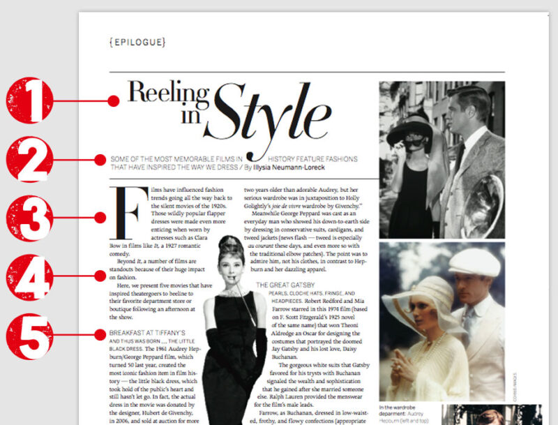
There are five, principle elements in standard, magazine article typography. First and foremost, the Headline. This is followed by the Standfirst, then the First Para and then we are into the article’s Body Copy. Within the body copy, we use a device in amongst the paras called a Subhead or Crosshead.
A typical magazine article will look like this:

Magazine typography is designed to capture the attention of the reader and draw them into the article. The headline grabs the eye, then the standfirst tempts with a precis of the juiciest contents. The first para styling, often with a drop cap and sometimes with first line stying, serves to guide the reader into the start of the article proper.
A subhead goes here
The subheads function both as little tempters and as bookmarks. They are the cherries on the cake, inviting the reader to dip into the content under them and also serving as signposts to help the reader navigate the article.
A ‘pull-quote’ is a device for tempting the reader into the story
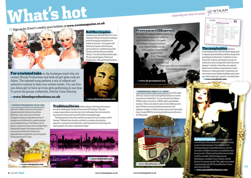
The subheads also serve the article up in bite-sized portions. A full page of plain text is intimidating, the reader will need to be determined to tackle it. Similarly, pull-quotes (aka ‘call-outs’) serve up tasty titbits and break up the body copy. Typography is all about making articles easy to read and these tricks have endured for so long because they work so well. Which begs the question, why don’t websites use them?
From web offset to the web online
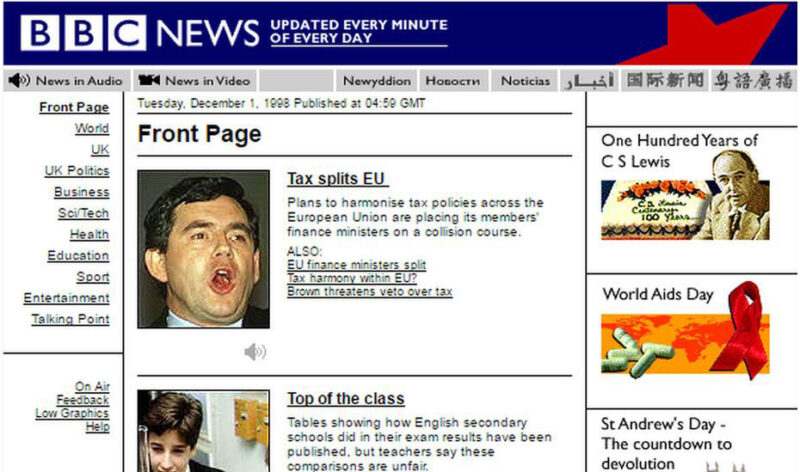
When the world wide web arrived with the brand new concept of online publishing, it was incredibly limited. In the 1990s, we had barely half-a-dozen fonts that we could use, chosen for us by programmers. We did not even have Comic Sans back then.
The development and expansion of Cascading Style Sheets (CSS) and the online hosting of fonts, means we can now use all the tricks of magazine typography to make our web pages as interesting and digestible as we do in print.
Google hosts an ever-expanding library of fonts, free to use, and a number of online services like Font2Web and Font Squirrel, convert any desktop font you have into a web one. Thus, we can use any font we like and using CSS, we can style them however we choose…
Website typography requires designing and programming. A programmer might know how to use CSS to select the first and second paras but it takes a designer to know what to do with this.
In this website, we use a first para which has its own styling and a drop cap, then the body copy with its own font and styling. We also use subheads and pull-quotes to break up the body of the text. On web pages, it is very easy, especially on the smaller devices, for the screen to be filled completely with body copy.
Automatic application
It is quite possible to build a website such that the styling is applied automatically and this is what we do at Graphic Violence. We build the typography in so that as you enter your copy and post your content, no coding is needed, the styling is applied automatically – but only to those elements whose positions always fall in the same place.
The headline, first, second, last para – all can be identified with CSS selectors and styles applied. The subheads and pull-quotes, however, are placed in the article at the discretion of the author. Thus, the author does need to tag these elements for the appropriate style to be applied.

It is worth noting that while the ever-expanding range of CSS tools allows all manner of design tricks to be deployed, CSS will not design web pages for you. Decisions about what fonts to use and how to use them, and how and where to use subheads and pull-quotes, requires a designer’s eye.
Pointers for website typography
- Choose two fonts, one a ‘display’ font for your headings and then something clean and simple for your body text. It is old school practice to mix a serif font with a san-serif one, just as we do at Graphic Violence;
- Give your opening para its own, distinct style to separate it from the body copy;
- In your body copy, keep your paras short. Three to five sentences is a good length;
- Use subheads and pull-quotes when you don’t have images to break up body copy. Aim to never have more than three paras without interruption;
- Use bullet lists like this one, readers love them for quick information and they break up body copy, and
- Use an ‘end mark’ to tag the end of an article. A very traditional and professional magazine style and fully programmable.
Designer v Programmer
In print there are few limits, a designer can let their imagination run wild. On the web, design needs to be complicit with programming and since the two skills often come from two different people, it can be an uneasy truce.
If every programmer who has ever told a designer that his idea isn’t possible puts a pound in the studio’s ‘I can’t be arsed’ jar, there will be endless funding for the Friday drink-up. Equally, though, a designer who does not know what can be achieved with programming is limiting their designing.
As the programming capabilities available on the web increase, so it opens to more creative design. The roles of programmer and designer overlap all the more as the skills of one become intrinsic to the role of the other. Cue the end mark…
Resources
- Google Fonts
- DaFont – Download fonts
- 1001 Fonts · Free Fonts Baby!
- Use your favourite font on your website – Font2Web
- Create Your Own @font-face Kit – Font Squirrel
Read More
- Typography rules and terms every designer must know – Creative Bloq
- 50 Examples Of Stunning Typography In Magazine & Book Designs – Bashooka
- Best Examples of Typography in Web Design | Inspiration – awwwards
- Top 50 Best Examples of Websites Using Typography – intechnic
- 9 Best Practices for Using Typography in Web Design – Hackernoon
- A Reference Guide For Typography In Mobile Web Design – Smashing Magazine
