Preparing a presentation on the workings of graphic design would be no different to any other campaign, thinks Tim. I’ve got a message to deliver and an audience to target
A creative explaining how graphic design works is like a magician showing how a trick works. Detailing the mechanics of the procedure does the job but performing the trick convinces the audience. I was going to need a rabbit, and a hat…
Taking risks
With any campaign, taking a chance is an essential ingredient for success. Play safe, don’t make a noise, don’t stand out from the crowd – said no client’s brief, ever. I’ll need a demonstration. To this end, I deploy my ‘The Coffee Shop’ exercise that I created for my article Always Judge A Book By Its Cover back in 2019.
Try this at home
We created a project for ourselves whereby our imaginary client is ‘The Coffee Shop’ and wants a design for a flyer. The Coffee Shop has no brand identity yet. The client wants ideas to represent different themes the cafe might adopt to target different demographics.
As designers, we’ve allowed ourselves three things for this exercise:
- a font;
- an image representing coffee, and
- an image to set the scene.
We’ve not allowed ourselves to cheat the ‘story-telling’ by, say, sticking a photo of the Eiffel Tower in to represent a Parisian street cafe, we’re aiming for a little more subtlety. This gives the viewer more opportunity to interpret the design for themselves, giving greater engagement.
Have a look at our flyer designs and see what kind of a cafe they make you imagine. Then mouseover to see what we were thinking and if your vision matches ours.
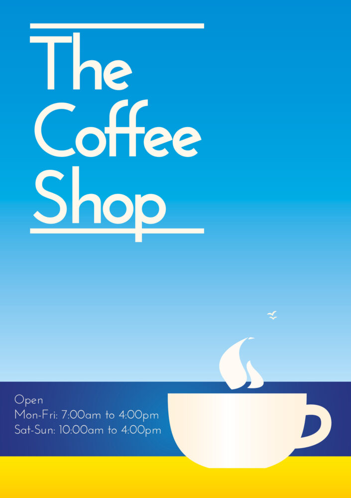
Classic
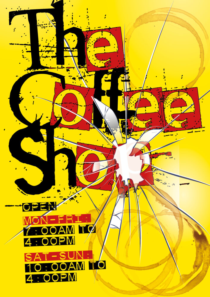
Punk
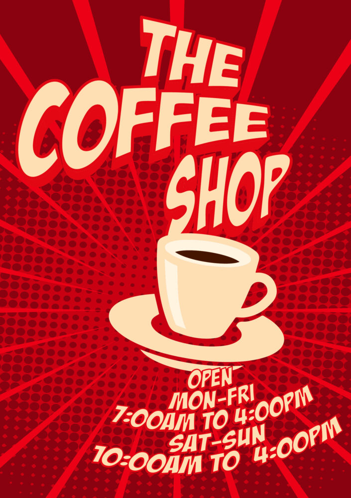
Comic Book
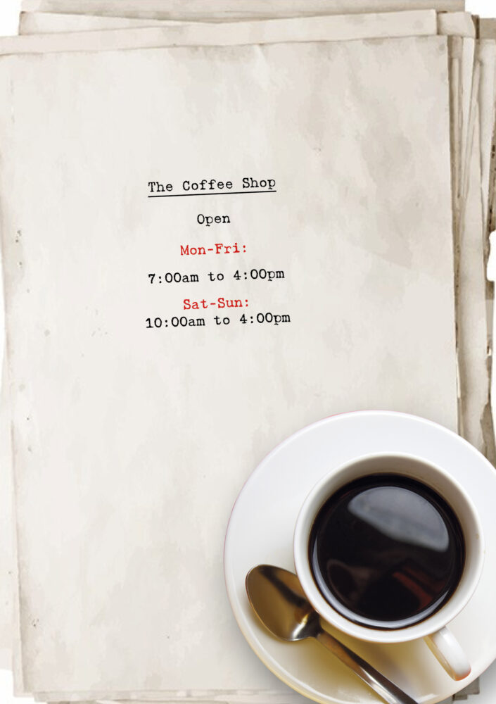
Scritore
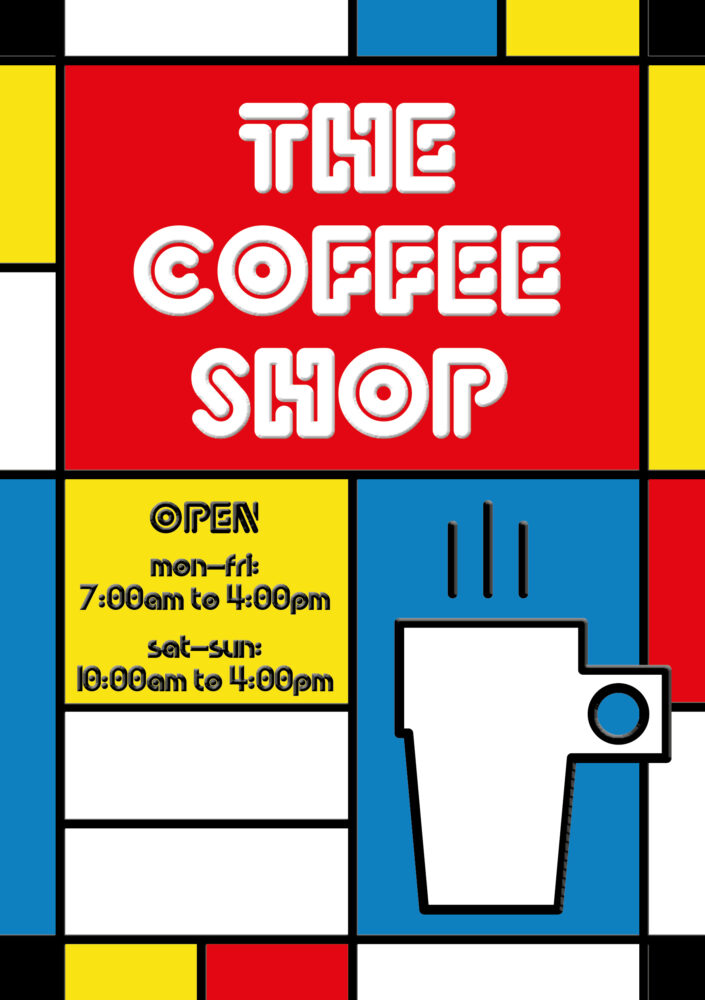
Art Haus
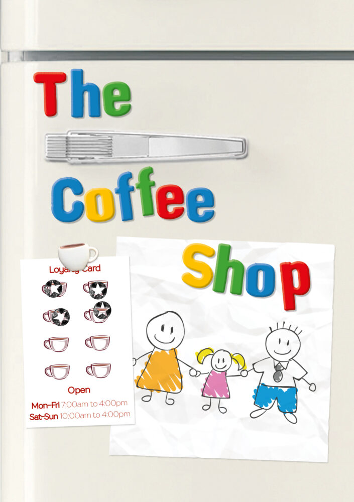
Kindergarten
My plan is to talk the students through the thinking that goes into creating images like these and then ask them to decode The Coffee Shop posters. If they get the same thoughts out that I’d put in, this would be an elegant proof. Clearly, though, there was potential for this to go horribly wrong…
The trick
We embed our messages in our campaigns with semiotic shortcuts. We do this because, typically, a viewer will decide whether or not to pay further attention to our campaign in a matter of seconds. In that brief moment, we have to deliver a message that resonates with them.
To do this, the theme of the message connects with the viewer’s experiences and interests. But it also needs to have some space for people’s own interpretation, or it risks having too narrow a relevance.
However, the flexibility in its interpretation can result in the wrong message. It is a delicate balancing act.
Crash and burn
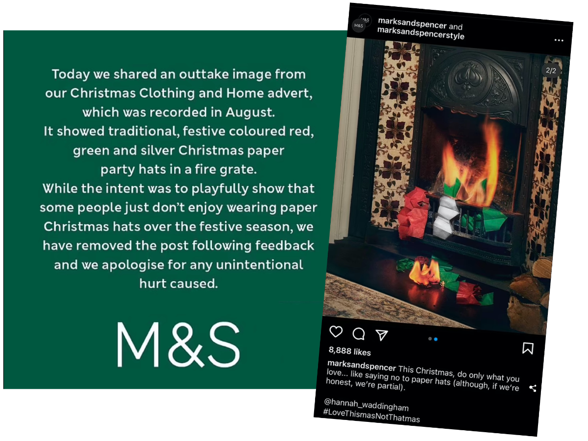
There is always a risk of misinterpretation. To reduce this danger, we canvas for opinions from fellow designers, creative teams and poll sample groups. But even with the broadest, most diverse team collaborating on a big-budget job, things can still go south.
I asked the students to work in groups and record what thoughts the posters provoked in them. Then I would reveal the notes I had made when I had conceived the designs. If the inferences they drew from my Coffee Shop posters matched mine, then this would be a powerful demonstration of how the psychology in graphic design works.
The reveal
As we compared our notes, some of the students’ keywords and descriptions were such a match for mine it felt almost uncanny. I felt like a magician showing them the card they were thinking of.

I felt like a magician showing them the card they were thinking of
As creatives, working daily in our communications and marketing, we can become so familiar with the protocols that we forget how magical it is. That we can get an engaging message from our mind and into that of a total stranger via a static, graphic design, is extraordinary.
Last words
It was an educational experience for me as well as for the students. Like all graphic designers, I obsess over fonts. Sometimes, I think I spend more time on font choices than I do on a project as a whole. What I did not know is that for the Joe Public, the story-telling in a font is completely under the radar. They get the message but it is so intuitive as to be taken as read – literally.
Not sure if this revelation will make me more or less obsessive about font choices, time will tell. Probably more, though.

