Humans evolved the ability to find one thousand words in a picture way back in the early years of their evolution and it turned out to be a lifesaver
Two cavemen go down to the waterhole each morning. As they kneel together, drinking from their cupped hands, one says to the other; ‘Look at that pattern, amongst the grass, that could be a tiger!’ But his companion sees nothing in the zig-zags of the tall, swaying grass. ‘Nah, you’re imagining it,’ he says and laughs as his friend runs away in fright.
The next morning, the same thing happens. ‘You’re always seeing tigers when there are none,’ laughs the one caveman, while his imaginative companion flees in fear.
And on the third morning, the skittish caveman again thinks he can see the pattern of a tiger’s stripes among the grass stems, advises his sceptical friend and flees. This time, he is right and he survives. His friend, however, does not get to contribute to the evolution of the human race…
A backstory of a thousand words
On the grander scale, the fearing at first sight it is a snake before realising it is just a cucumber, is a rare (hopefully), life-saving reaction, but we jump to (less critical) conclusions in the same manner in every moment of every day. These judgements save us a great deal of time and energy and we are right far more often than we are wrong. Graphic designers use visual cues to direct our decisions. We do judge books by their covers and if it turns out we got the wrong message, then somewhere, a graphic designer gets fired.
Accidental Renaissance paintings
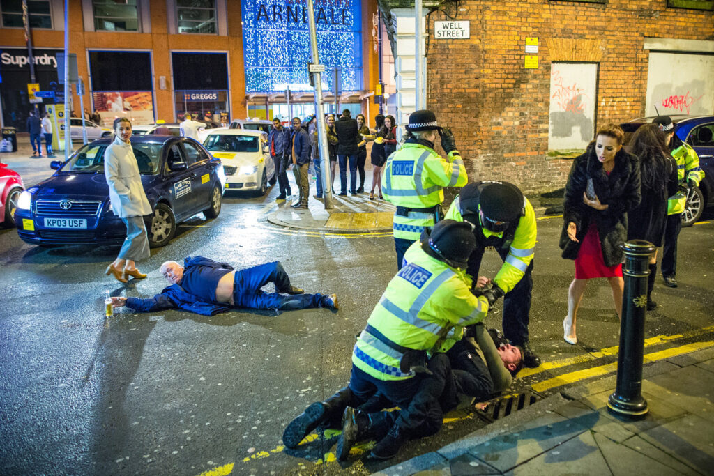
The Google search ‘accidental Renaissance’ throws up a great many photos being shared on social media in which people see something that looks like a classical work of art. Photographer Joel Goodman’s photo of the drunken chaos of a Manchester street in the early hours of New Year’s Day, 2016, is a recent example that went viral.
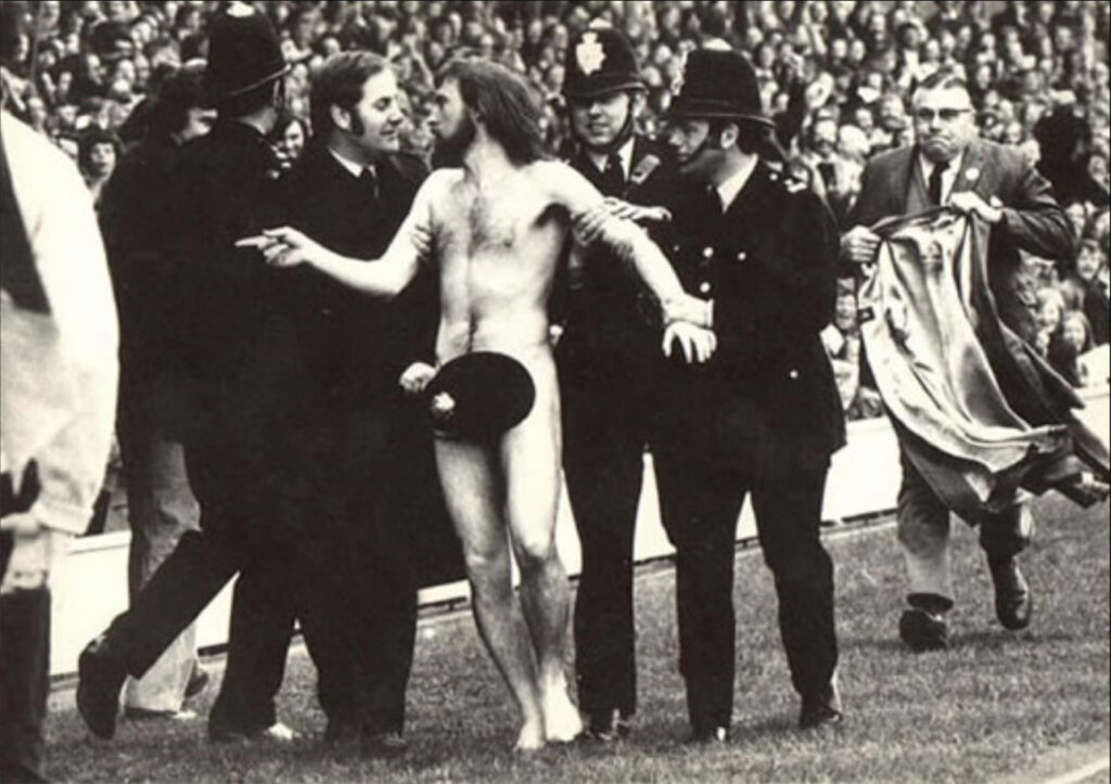
But this is nothing new, long before there were social media back in a time when ‘going viral’ was a bad thing, Ian Bradshaw’s photo from 1974, of a streaker at a rugby match at Twickenham, was lauded as an ‘accidental Renaissance’ composition.
What are the viewers seeing in these photos? Well, it’s not got much to do with an appreciation of classical art. The majority of the people sharing these images don’t know much about classical art of any sort, let alone Renaissance, or they’d notice that really, these photos look more Baroque in their composition.
It is about storytelling.
In the classical paintings, the artists are telling stories of moments of great significance; victories in warfare, adoration of gods and political events. When photographers capture moments which come out looking like these classic paintings, it is because their images contain gestures, postures and expressions in a composition we recognise.
Jumping to conclusions
These photos, like the classical paintings they remind us of, have cues in their compositions that make connections with our own experiences and knowledge. It is these connections that create the story that we find in the image.
Without any deliberate action by the photographer, the viewer casts the policemen in the role of Roman invaders
We are not being duped.
No one looks at Bradshaw’s ‘Twickenham Streaker’ photo and wonders what Jesus Christ was doing getting arrested at a rugby match but we do make the associations. His hair and beard, the modest nudity and the outstretched arms all echo classic portrayals of Jesus. Then add in the authority figures in uniforms restraining him and we’ve got a visual metaphor for rebellion versus authority. Without any deliberate action by the photographer or the subjects in the photo, the viewer casts the policemen in the role of Roman invaders.
Graphic designers are competing for the attention of viewers in a very crowded and noisy place. When they do get a viewer’s attention, they need to tell a story in a way that resonates with the viewer and to do it quickly. Designers are quite deliberately building into their work the cues to trigger the associations they want the viewer to make.
Try this at home
We created a project for ourselves whereby our imaginary client is ‘The Coffee Shop’ and wants a design for a flyer. The Coffee Shop has no brand identity yet. The client wants ideas to represent different themes the cafe might adopt to target different demographics.
As designers, we’ve allowed ourselves three things for this exercise:
- a font;
- an image representing coffee, and
- an image to set the scene.
We’ve not allowed ourselves to cheat the ‘story-telling’ by, say, sticking a photo of the Eiffel Tower in to represent a Parisian street cafe, we’re aiming for a little more subtlety. This gives the viewer more opportunity to interpret the design for themselves, giving greater engagement.
Have a look at our flyer designs and see what kind of a cafe they make you imagine. Then mouseover to see what we were thinking and if your vision matches ours.
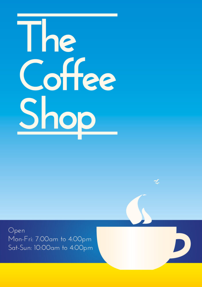
Classic
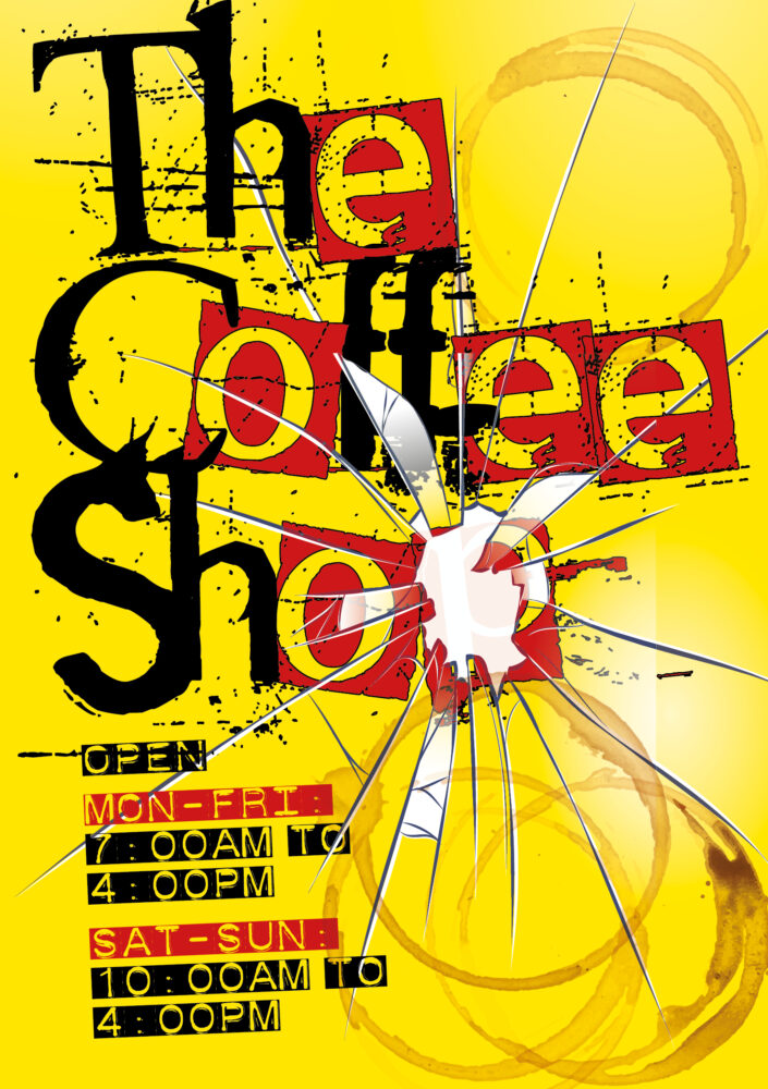
Punk
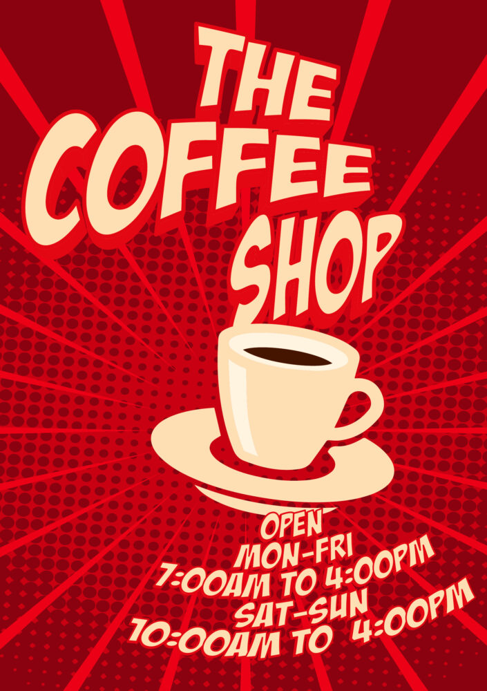
Comic Book
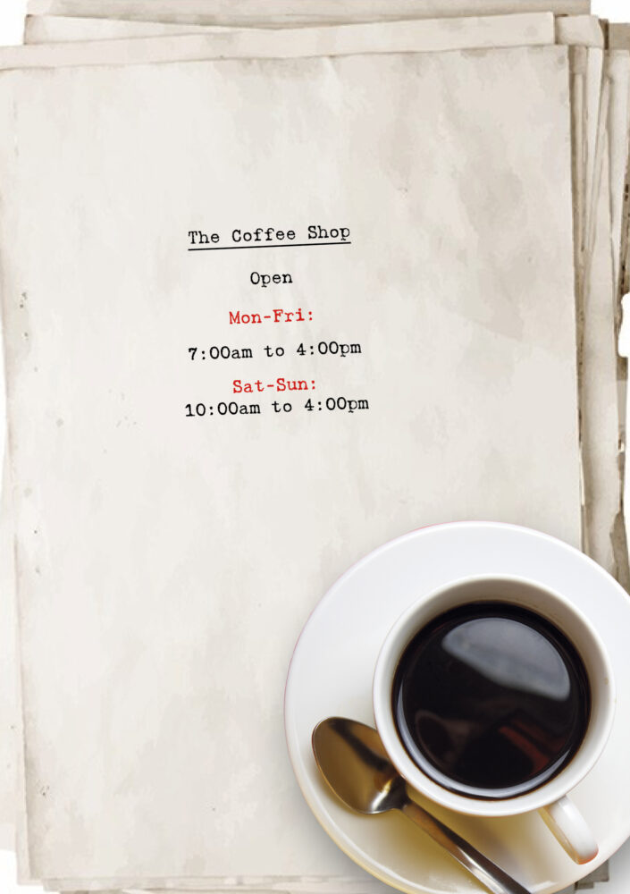
Scritore
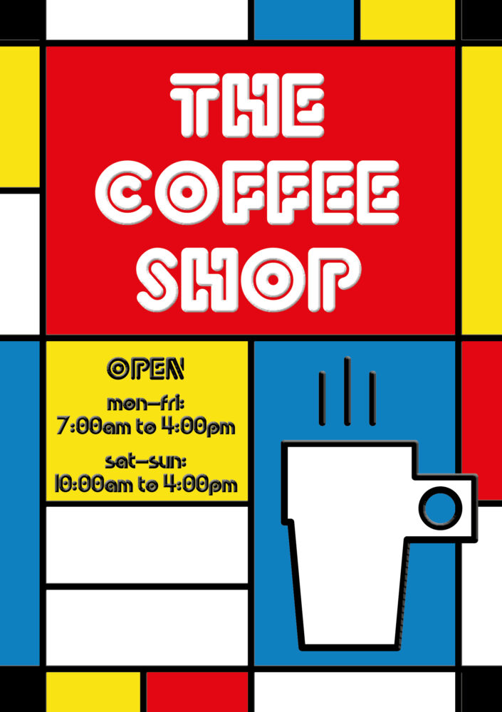
Art Haus
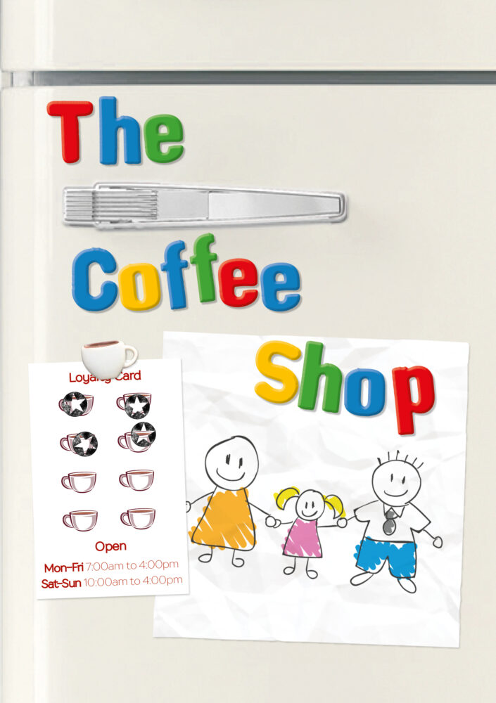
Kindergarten
So next time you judge a book by its cover and it turns out to be just the sort of thing you love to read, have another look at the cover and ask what it was about it that piqued your interest – and know that was deliberate. And next time a discarded sock lurking behind a door causes you to start, don’t think yourself a fool for thinking it was a rat – it is the way your brain and your eyes are wired.
Photographers
Resources
Read more
- 19 Photos That Accidentally Look Like Renaissance Art – BuzzFeed
- No, that viral photo is not just like a Renaissance painting – The Outline
- The Twickenham Streaker – Iconic Photos
- Visual cognition: An introduction – ScienceDirect
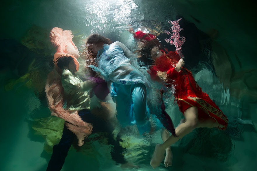
- Dynamic Underwater Photos Look Like Dramatic Baroque Paintings – My Modern Met
